Adapting your brand identity for lanyards and keyhangers
Standard brand guidelines often rely on exact proportions and detailed graphics that look excellent on flat, wide surfaces. When you apply those same rules to a narrow lanyard strap, the results can quickly become difficult to read. A detailed crest or a long company name will shrink down to fit a ten-millimetre or twenty-millimetre width, making the text blurry and the shapes indistinct. You need to approach the design with readability as your primary goal rather than strictly replicating your primary logo.
Lanyards and keyhangers serve as functional identification tools before they act as promotional items. Whether your team manages a school campus or a large event venue, the strap helps security personnel and attendees recognise who belongs in specific areas. If the branding on the lanyard strap is too small or cluttered, it fails to support quick visual recognition. Adapting your artwork ensures that the final printed product looks professional and serves its primary identification purpose effectively.
How to fit logos onto narrow lanyard widths
Adjusting your artwork to fit a narrow space requires careful planning and a willingness to step away from complex brand assets. You must evaluate the physical constraints of the strap and decide which visual elements communicate your identity most clearly. Taking the time to adjust the scale properly prevents the final product from looking cluttered and unprofessional.
Choosing the right strap width for your design
The physical width of the lanyard strap dictates exactly how much space you have for branding and text. A standard ten-millimetre width only supports a very basic line of text or a highly simplified icon. If your organisation requires a more visible logo, you will need to select a wider fifteen-millimetre, twenty-millimetre, or twenty-five-millimetre strap. Matching the strap width to your design requirements prevents your artwork from looking cramped or unreadable.
Simplifying complex logos for print
Complex crests, fine lines, and intricate icons rarely print well on narrow textile surfaces. You should remove secondary elements from your logo and focus solely on the most recognisable core shape. By scaling down to a simplified version of your brand mark, you prevent ink from bleeding together during the printing process. This stripped-back approach guarantees that the logo remains crisp and identifiable even from several metres away.
Using clear text instead of visual icons
Sometimes the most effective way to brand a lanyard is to abandon the graphical logo entirely and use clear typography. Printing your organisation’s name in a bold, legible font ensures immediate recognition without the risk of distorted graphics. You can select a typeface that aligns with your brand guidelines and space the letters out evenly along the strap. Clear text often provides better visibility in active environments where people view the lanyard from multiple angles.
Choosing lanyard colours that maximise readability
The background colour of the lanyard strap interacts directly with the ink colours you choose for your text and logos. If you select a dark blue strap and print black text over it, the lack of contrast will make the branding practically invisible. You should aim for high contrast between the base material and the printed design to ensure legibility at a distance. A bright white or yellow ink on a dark background, or a dark ink on a light pastel strap, will naturally draw the eye and remain readable.
Real-world visibility is crucial when you deploy lanyards in busy environments like trade shows or hospital wards. Lighting conditions change constantly, and low-contrast designs quickly blend into the wearer’s clothing. Testing your proposed colour combinations on a computer screen can sometimes be misleading because screens emit light, whereas printed textiles absorb it. You must prioritise stark, clear colour contrasts to prevent costly design mistakes and ensure quick visual recognition.
Creating a clear layout across the printed lanyard
Arranging your artwork into a logical sequence prevents the lanyard from looking cluttered when worn around the neck. You need to establish a clear pattern that balances the printed elements with empty space. Following a systematic design process helps you prepare the artwork file correctly before sending it to the printer.
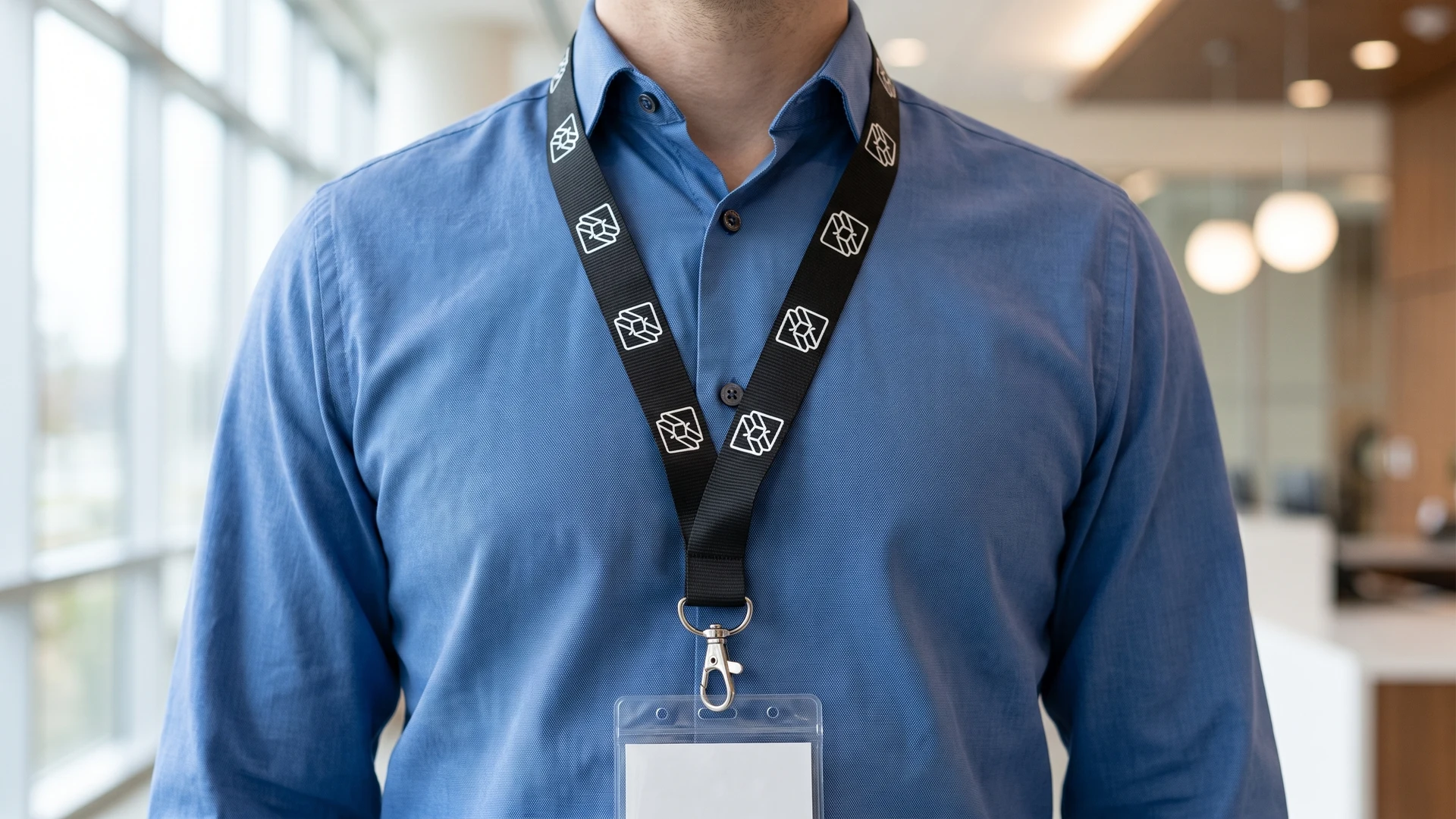
- Defining the repeating pattern: You must decide how many times your logo and text will repeat along the length of the strap. A continuous repeating pattern ensures that the branding remains visible regardless of how the lanyard twists or folds. You should calculate the exact length of the artwork segment and duplicate it evenly to maintain a consistent rhythm.
- Inserting necessary blank space: Empty space is just as important as the printed ink when laying out a narrow textile design. You need to leave adequate gaps between each logo or block of text so the elements do not run into one another. This blank space acts as a visual break, making it much easier for the human eye to process the individual words or icons.
- Accounting for the safety breakaway: You must identify where the safety breakaway and the final attachment point will sit on the finished product. The manufacturing process will cut off or stitch over any artwork placed directly over these connection points. You should position your layout so that the most important text falls squarely on the visible parts of the strap, away from the seams.
Selecting a printing method for your brand design
The complexity of your artwork and your specific colour requirements will dictate which printing technique you should choose. Each method applies colour to the textile differently, affecting both the final appearance and the durability of the strap. Understanding these technical differences helps procurement teams select the most appropriate option without unnecessary frustration.
Screen printing for solid colours
Screen printing applies a thick layer of solid ink directly onto the surface of a flat fabric strap. The process uses a mesh stencil coated in light-sensitive emulsion to push ink onto the material with a rubber blade known as a squeegee. Because the ink sits on top of the fabric and cures through a heat press, the resulting colours are exceptionally vibrant and opaque.
This technique works best for simple logos and clear typography that rely on one or two solid colours. It does not handle gradients or highly detailed photographs well due to the physical limitations of the mesh screen. You should choose screen printing when you need bold, high-contrast text that stands out sharply against the base colour of the lanyard.
Dye sublimation for detailed artwork
Dye sublimation uses heat and pressure to turn solid dyes into a gas, which then bonds permanently with synthetic polyester fibres. This chemical process means the ink actually enters the open pores of the polymer rather than sitting on the surface. When the material cools, the pores close, locking the design inside the fabric so it retains its natural soft texture.
Because the gaseous transfer allows for molecular mixing, dye sublimation can produce sharp lines, smooth colour gradients, and photo-quality images. The resulting print is highly durable and will not crack or peel easily through washing or daily wear. You should use this method when your brand identity requires full-colour artwork or edge-to-edge printing across the entire strap.
Woven logos for simple designs
Jacquard woven designs do not use applied ink, but instead create the pattern directly within the structure of the narrow fabric strap. Randomised electronic needle looms map out a digital grid to control individual vertical warp threads and horizontal weft threads independently. As contrasting yarns swap positions, the brand logo emerges inherently on the face and back of the band.
This method produces an incredibly durable product because the design is physically woven into the material itself. It is ideal for very simple, bold designs that do not require fine details or complex colour matching. Woven logos offer a classic, textured finish, but you must keep the artwork minimal to ensure the threads can accurately replicate the shape.
Reviewing your lanyard design before production
Before you approve the final order, your team should perform a practical review of the artwork file to ensure it meets all identification requirements. You should print the layout on paper at the exact physical width of the lanyard to test its readability at a glance. Confirming that the text is legible, the contrast is strong, and the logo sits clear of the safety connections builds confidence in the final product. A thorough check guarantees that the chosen design will perform well in real-world scenarios and keep your staff or visitors easily identifiable.
How do I choose lanyard colours that keep my logo readable?
Choose strong contrast between strap and artwork. Prioritise light on dark or dark on light, not similar mid tones. If your logo is light or thin, add a subtle outline. Test at arm’s length and in grayscale to cover common colour vision differences.
Should I repeat the logo or run the full brand name along the strap?
Repeating a compact logo usually keeps branding visible from any angle. Lanyards twist and bunch, so long names and slogans are often cropped. If you include text, keep it short, use a clear weight, and leave space near the edges. Put detail on the badge holder.
Which printing method is best for my lanyard artwork?
For solid spot colours and simple marks, screen printing pushes ink through a stencil to create bold shapes with good durability after heat curing. For fine detail and gradients on polyester, dye sublimation bonds dye inside the fibres. Jacquard weaving builds two tone logos into the strap itself.
How can I keep the design facing outward during wear?
Print on both sides so a logo is always visible. Align the repeat so one mark sits just above the attachment when worn. Use a flat swivel hook to help the strap lie correctly. During distribution, quickly check orientation and adjust for consistent appearance.
Will my brand colour look different on a lanyard compared with screen or paper?
It can shift because textile inks and polyester reflect light differently from coated paper. Sublimation dyes integrate into the fibres, while screen print ink sits on top. Ask for a physical sample or pre production proof, then review under daylight and indoor light.