Branding keyhangers for shared access and fleet vehicles
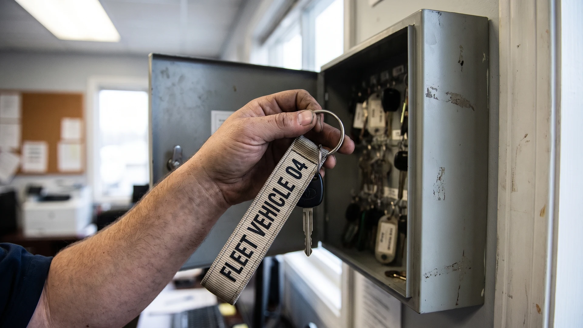
When multiple staff members use the same fleet vehicles or facility doors, keeping track of the keys becomes a daily operational challenge. Intentional branding on keyhangers transforms a simple strap into a highly functional tool for identification and retrieval. Instead of viewing the printed text purely as corporate promotion, workplace managers can use it to clearly label which department or vehicle the keys belong to. This practical approach helps your team instantly recognise the correct set of keys and ensures they return them to the right location at the end of a shift.
Choosing the right strap width for readable text
Selecting the physical dimensions of your key strap directly affects how much contact information you can include and how easily people can read it. You need to balance the necessity for clear text against the risk of creating an overly bulky item that frustrates users. The width of the fabric limits the height of your letters, which dictates whether the text remains legible from a distance or requires close inspection.
Evaluating narrow straps for basic identification
Narrow straps typically measure around ten to fifteen millimetres wide and offer a lightweight solution that avoids adding unnecessary bulk to a keychain. This slimmer profile works well when you only need to print a short company name or a simple departmental code. Because the printable area is restricted, you must use clean and bold fonts to maintain readability. These smaller dimensions prevent the keyhanger from becoming cumbersome when users carry it in their pockets or attach it to a belt loop.
Using wider straps for full contact details
Wider straps measure twenty millimetres or more and provide a substantially larger canvas for your printed text. This extra space allows you to include multiple lines of information, such as a return phone number alongside the organisation name. Procurement teams often choose this larger size when the primary goal is ensuring lost keys contain enough detail to facilitate a safe return. While the wider fabric increases visibility, you should always test the layout to ensure the design remains clean and easy to read.
Why simple one colour prints work best for shared keys
Keyhangers for shared access endure constant physical handling, friction, and environmental exposure that can quickly degrade complex artwork. A single colour screen print applies one uniform layer of ink directly onto heavy duty fabric straps like polyester or nylon. This method creates a strong surface adhesion that resists peeling, because the ink presses deep into the textured weave of the material. By avoiding overlapping layers of ink, you eliminate the structural weak points that often crack or split under heavy daily stress.
Passing the printed item through the curing dryer only once prevents the ink from becoming brittle over time. This single heat cure keeps the design flexible, meaning the printed text bends naturally with the fabric as users fold or store the keyhanger. The thinner overall print weight also reduces friction tears when the strap rubs against metal hardware or pockets. Choosing this simple printing method helps you maintain crisp readability and wear resistance over months of repetitive use.
Essential contact details to include for misplaced keys
When you design a keyhanger for shared access, the information you print serves as the primary recovery tool if the keys are lost. You must carefully assess which contact details facilitate a quick return without compromising the security of your buildings or vehicles. Guiding your facility managers through this risk assessment ensures that every printed word serves a practical purpose.
Adding department or company names
Including your company or department name establishes immediate ownership when someone finds the misplaced item. This basic level of identification often provides enough context for an employee to hand the keys back to the correct front desk or security office. You should use clear abbreviations if the full organisation name forces the text to become too small to read easily. Keeping the name simple ensures that anyone who picks up the keyhanger understands where it belongs at a glance.
Providing safe return phone numbers
A dedicated return phone number gives the finder a direct way to report the located keys without needing to travel to your facility. You should use a general reception or security desk number rather than a direct line to a specific staff member. This ensures someone is always available to answer the call and arrange the secure retrieval of the missing items. Printing the number in a large and legible font makes the recovery process as straightforward as possible for the person helping you.
Protecting vehicle and access security
While identification is helpful, you must explicitly avoid printing information that exposes your physical security or vehicle locations. Never include specific door numbers, license plates, or exact street addresses on the fabric strap. If the keys fall into the wrong hands, this sensitive data transforms a simple lost item into an immediate security vulnerability. Limiting the text to a general phone number and a broad company name provides a safe balance between recovery and protection.
Steps for designing an effective keyhanger layout
Creating a functional design requires a logical approach to laying out your text and spacing your elements. By following a structured process, you can prevent overcrowding and guarantee that the final product serves its practical purpose in the workplace. These concrete steps will help you confidently prepare your artwork before you order the physical items.
- Select the primary information: Identify the absolute minimum text required to safely return the keys, such as a company name and a general phone number. Removing unnecessary slogans or decorative graphics ensures the essential contact details remain the focal point of the design. This focused approach prevents the strap from looking cluttered and confusing.
- Determine the text size and spacing: Scale your chosen font to fit comfortably within the physical width of the fabric strap, leaving a clear margin along the top and bottom edges. Adequate spacing between the letters prevents the ink from bleeding together during the manufacturing process. A well-spaced layout guarantees the information is easily readable from a comfortable distance.
- Verify the legibility before production: Print your proposed layout on a standard piece of paper at the exact size of the final product to test how it looks in reality. Pin the paper to a shirt or hold it at arm’s length to simulate how the text will appear during daily use. This simple physical check helps you catch sizing errors and make necessary adjustments before committing to a full production run.
How wide should a key strap be for clear branding without adding bulk?
Aim for a medium-width strap for daily key use. It gives enough surface for a readable logo and short text while staying comfortable on a ring or clip. Use a narrow strap for minimal setups and a wider strap when carrying heavier key sets.
Is a single colour print enough for fleet and shared keys?
Yes, a single colour screen print is usually the clearest and most durable on high-use straps. Screen printing pushes ink through a mesh stencil, creating a solid, even layer that bends with the strap. Strong contrast between ink and strap colour improves readability.
Where should we place return contact details without cluttering the strap?
Print the brand or department on the front and place return details on the reverse. Use one concise method such as a short phone number, an email alias, or a short web address. Avoid long addresses and dense text that shrink legibility.
Which printing method holds up best on shared keyhangers?
Engraving on a metal tag is the most durable for text that must stay readable. For fabric straps, single colour screen printing wears well under frequent handling. On rigid plastic tags, ultraviolet light cured printing, where ink hardens under UV light, resists scratches and chemicals.
How can we make department or vehicle IDs easy to read at a glance?
Keep the layout simple with a clear hierarchy. Use one logo, a short department code, and high-contrast text placed in a consistent position along the strap. Colour coding by department or vehicle type helps teams sort keys quickly.