Balancing design and readability on a printed lanyard
Many organisations try to fit their entire brand identity onto a single lanyard strap, which quickly compromises readability. A printed lanyard should instantly communicate who the wearer is or which group they belong to, rather than serving as a comprehensive business card. When you start your design process, Lanyard & Keyhanger recommends thinking carefully about what the lanyard actually needs to achieve in a real-world setting. By prioritising clarity over quantity, you can create a professional and functional design that supports the actual use case perfectly.
How too much information reduces visibility
Understanding the physical constraints of a lanyard helps you avoid common design mistakes that ruin your layout. A strap has limited surface area, and squeezing in a logo, a slogan, a website, and a phone number simultaneously creates visual clutter. This clutter makes the text impossible to read when the wearer is moving around a busy environment.
The physical limits of strap width
Standard lanyard straps typically measure between ten and twenty-five millimetres wide. This narrow canvas restricts how tall your text or graphics can be before they bleed over the edges or become distorted. When you try to stack multiple lines of information within this limited width, the printing becomes too small for the human eye to process quickly. You should always respect the physical boundaries of the fabric to maintain a clean appearance.
Reading distance and daily movement
People rarely stand perfectly still, and the lanyard strap will twist, fold, and swing as the wearer goes about their day. Observers usually need to identify the wearer from several feet away, making large and legible text essential. Intricate details and tiny fonts blur together from a distance, completely defeating the purpose of branding the strap in the first place. You can improve reading distance significantly by scaling up a simple logo or a single bold word.
Choosing one primary message
The most effective lanyards focus on a single piece of core information that viewers need to see immediately. You might choose your company name, an event title, or a specific role designation like staff or visitor. By cutting unnecessary text or graphics, you give this primary message the space it needs to stand out clearly. This disciplined approach leaves your team with a confident design that serves its practical purpose without looking messy.
Simple design combinations for different users
Different environments require different approaches to identification, so your design should match the specific audience. Human resources (HR) teams, school administrators, and event organisers face unique challenges when setting up identification systems. Tailoring your objective recommendations to these specific groups ensures that every lanyard fulfills its necessary function.
Workplaces and corporate staff
Corporate staff usually wear their lanyards every day alongside professional clothing, which calls for a subtle and professional design. A simple company logo printed in a single colour on a plain background works well for most office environments. You do not need to print contact details on the strap, as the attached identification (ID) card holder will carry the employee’s specific access credentials. This understated combination keeps the focus on the actual name badge while maintaining a unified corporate appearance.
Schools and student identification
Educational institutions need highly visible designs that help staff quickly distinguish between students, teachers, and authorised visitors. Printing the school name or specific year groups in large, bold letters across the strap allows teachers to identify people across a busy playground or hallway. A robust attachment is also necessary here to secure the required passes safely during active school days. Focusing strictly on the school name or group designation prevents confusion and streamlines the daily visitor-management process.
Conferences and short-term event guests
Short-term event guests require bold, immediate identification that helps attendees navigate large venues easily. Event organisers should consider printing the year and the conference name clearly on the lanyard, perhaps using different fabric colours to separate general admission from very important person (VIP) guests. You can skip printing website addresses or social media handles, as guests will already have this information on their phones or event materials. A simple, colour-coded design paired with a clear name badge holder creates a much smoother networking experience for everyone involved.
Making your final layout choice
Reviewing your chosen design elements one last time ensures that your final layout remains clean and purposeful. You should ask yourself if every printed word and logo genuinely helps observers identify the wearer or the organisation. Lanyard & Keyhanger provides these practical insights so you can confidently finalise a professional setup that serves your exact requirements. By stripping away visual clutter, you will deliver a highly functional product that your team can wear with pride.
What details should a staff lanyard include?
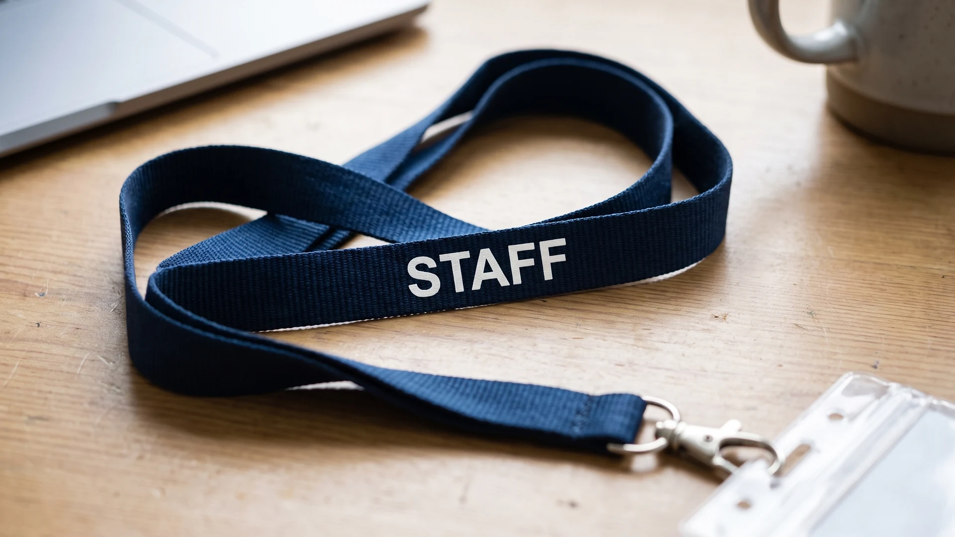
For staff, include your organisation name or logo on the strap and keep text minimal. Put personal names, titles, and departments on the badge where they can change easily. A repeated logo or a small role word such as Staff or Security helps quick recognition. Avoid long slogans.
What works best on visitor and event guest lanyards?
Prioritise role clarity and wayfinding for visitors and guests. Pair the event or venue logo with a short role label such as Visitor, Speaker, Crew, or Press. Keep marketing lines off the strap and place schedules or sponsor lists on the badge or program. This improves scanning.
Are contact details useful to print on the strap?
Print a phone number or email only when it serves a clear task. A lost property line helps keyhangers that carry keys, and a reception number can guide after hours calls. For most teams, a short website is cleaner. Contact details often change and clutter the strap.
Do Quick Response codes scan well on fabric lanyards?
Quick Response codes rarely scan well on fabric lanyards. Curves, movement, and texture break the pattern and create failed reads. Put the code on a flat badge or card instead for reliable scanning. If you must print one on the strap, use high contrast and spacing.
How do I keep text readable without losing the logo?
Keep the design readable by using contrast and few words. Choose one short line like a website and a clear logo, or pick a wider strap if you need more room. Screen printing lays down solid inks for bold marks. Dye sublimation infuses detailed full colour artwork.