Planning lanyard design for visible identification
A digital design file shows a flat lanyard, but the physical product twists and folds when a person wears it. If you do not plan for how the fabric hangs, important logos or text can easily vanish behind the neck or become hidden inside creases. Lanyard & Keyhanger provides practical guidance to help event organisers and workplace managers understand these physical limitations. By acknowledging where the design sits on the strap, you can prevent costly branding mistakes and keep credentials clearly visible for security and networking.
Understanding the natural fold of a worn lanyard
When a person puts a lanyard over their head, the flat fabric must bend to follow the shape of their neck and chest. This natural looping process means that different sections of the strap face outward at different points. The part resting against the back of the neck often faces upward or becomes hidden by collars, while the sections hanging down the chest will naturally twist. You must consider these physical mechanics to understand which parts of the strap will actually display your design to other people.
A flat digital proof does not represent this physical reality accurately. If you place a single continuous message across the entire length of the strap, the natural fold will inevitably break the text into unreadable segments. Event attendees and staff move continuously, causing the fabric to shift and flip against their bodies throughout the day. Recognising how the strap moves allows you to adapt your design so that the branding remains effective in a busy workplace or conference environment.
Designing repeating patterns for continuous visibility
Creating a continuous pattern ensures that your branding remains readable no matter how the lanyard twists or shifts. You can achieve this continuous visibility by applying strategic spacing, careful typography, and the correct print orientation. Taking the time to adjust these elements prevents your design from looking cluttered when worn.
Spacing logos for front visibility
Repeating your logo every one to two inches guarantees that a complete version remains visible even when the fabric flips. You should leave a minimum gap of half an inch to one inch between each repeated unit to prevent a cramped appearance. It is also important to maintain two to three inches of blank space near the attachment clip so the hardware does not crush the design. Keeping logos away from the rear safety breakaway clasp ensures that the functional cut in the fabric does not slice your branding in half.
Handling long slogans and text
When placing long text on a narrow strap, you must manage typography and print methods carefully to maintain legibility. Dye sublimation, a process that uses heat to transfer ink directly into the fabric fibres, preserves thin font lines without bleeding and is highly effective for detailed slogans. You should stick to clean sans serif fonts and increase the literal space between letters, known as kerning, so the characters do not blur together. Sticking to high contrast colours and avoiding background gradients will further ensure that small text remains easy to scan from a distance.
Choosing the right print direction
The fold at the back of the neck effectively rotates the fabric, turning the back of the strap into the front as it hangs down. To prevent your design from appearing upside down on one side, you should use dual-direction printing layouts that alternate the orientation of the artwork. Printing the logo upside down on the back side of the flat strap ensures it appears correctly when the lanyard loops over the neck. Requesting a pre-production digital proof from the manufacturer helps you confirm these viewing angles before the full production run begins.
How attachments affect logo placement
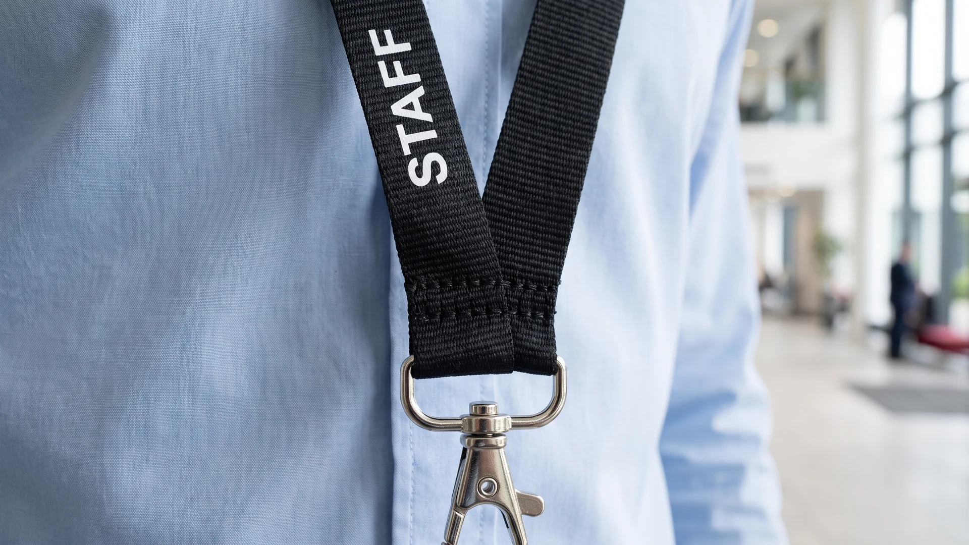
The bottom of the lanyard strap requires physical space to connect to metal or plastic attachments. Whether you use a simple metal hook or a detachable plastic buckle, the fabric must fold over the hardware and be stitched securely into place. This assembly process consumes several inches of the strap, creating a pinch point that distorts any design printed in that exact area. You must separate the printable area of the strap from the mechanical connection zone to maintain a clean appearance.
A common design error involves placing primary logos or important contact details right at the base of the strap. When the manufacturer stitches the hardware into place, the thread and the fold will permanently cover those crucial details. Furthermore, a large plastic badge holder hanging from the attachment can easily obscure the bottom section of the fabric. Leaving the bottom few inches of the strap entirely blank ensures your branding remains intact and fully visible above the credentials.
Steps to verify lanyard readability before ordering
Reviewing a flat digital proof is often not enough to confirm how the final product will look in a real environment. You can follow a simple physical testing process to catch layout errors and verify readability before you approve a bulk order. Setting up a physical test takes only a few minutes and prevents costly mistakes.
- Print the mockup: Print your digital design file onto paper at its actual physical width and length so you can evaluate the true scale of the text.
- Cut and fold: Cut the printed paper into a long strip and loop it around your neck to simulate the natural fold of the fabric.
- Check the orientation: Look in a mirror to ensure the text flows correctly down both sides of your chest and does not appear upside down after the loop.
- Verify hardware clearance: Pinch the bottom two inches of the paper strip together to represent the space consumed by stitching and attachment hardware.
- Assess readability: Stand a few feet back from the mirror to confirm that the text remains legible and that critical logos are not obscured by the pinch point.
Final checks for clear lanyard branding
Planning your layout around natural folds, stitching, and hardware ensures your final product looks professional in active environments. By spacing your logos generously, checking print direction, and leaving room for attachments, you protect the legibility of your brand. You should review these exact requirements with your manufacturer to confirm their print capabilities align with your design. Taking the time to test your mockup physically gives you the confidence to order lanyards that keep your credentials clear and visible every day.
How often should I repeat my logo on a lanyard?
Repeat the logo every 1 to 2 inches to keep a full mark visible as the strap twists. Alternate orientations so one set reads correctly on the return loop. Keep a 0.5 to 1 inch gap. Leave 2 to 3 inches blank near the attachment.
How do I set print direction so text is not upside down?
Use dual-direction printing so text reads from the wearer’s chest outward on both sides. Map the strap and mark the front runs. Note the sewing joint, any breakaway clasp, a safety connector that releases under pull, and the attachment. Request a pre-production proof, a layout, to confirm orientation.
How large should text be on a narrow lanyard?
Set text height to at least 70 percent of the strap width for clarity. Choose a clean sans serif font, meaning letters without decorative strokes, and add extra letter spacing, known as tracking. Use high contrast and solid colors. Dye sublimation printing infuses ink into polyester and preserves fine lines.
Where should I place contact details around clips and safety parts?
Keep information clear of hardware. Leave 2 to 3 inches blank above the clip or crimp, the metal band fixing attachment, to prevent text from bunching or disappearing in stitching. Avoid printing across a breakaway clasp or detachable buckle. If a badge holder covers the lower area, move details higher.
Will an all-over pattern affect logo alignment across a batch?
Yes, continuous step-and-repeat printing, a repeating layout across the roll, leads to variable placement when straps are cut from a printed roll. Some pieces may show cut edges or shifted margins. Use dense tossed layouts or generous spacing to hide variation. For exact alignment, print on pre-cut straps.